Unlike other coffee producers, Lykke Kaffegårdar owns the coffee farms together with the farmers. There they grow coffee organically without monocultures. They share their knowledge with nearby coffee farmers who in this way learn to grow really good coffee, which in turn generates economic sustainability. Good for the planet, good for the people.
Lykke’s unique business model and the committed people behind the brand were our most important inspiration through the design process. When they turned their industry upside down, we could do nothing but do the same with ours.
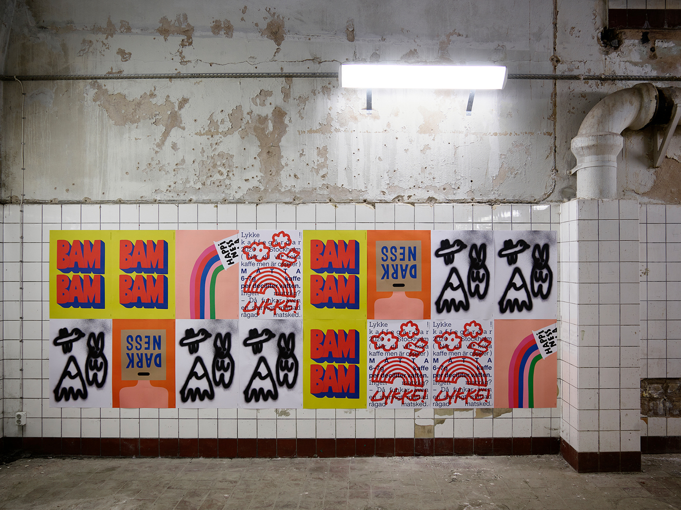
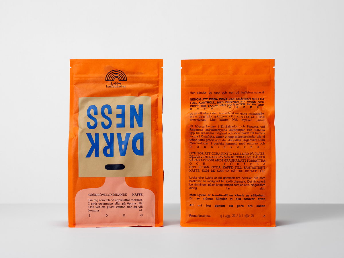
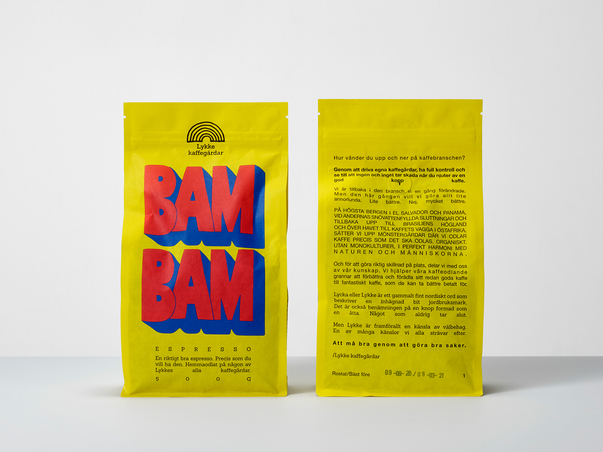
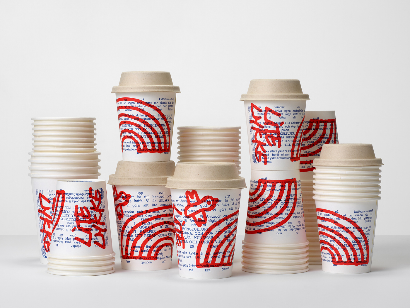
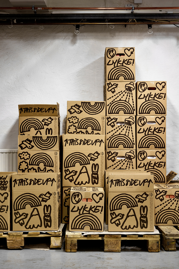
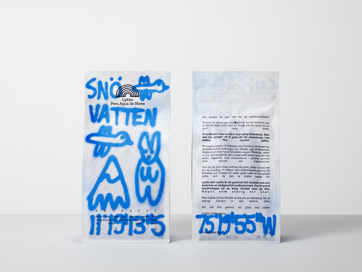
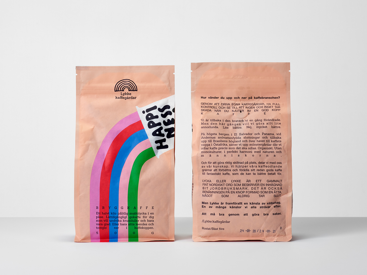
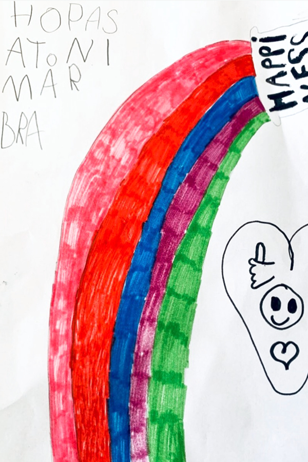
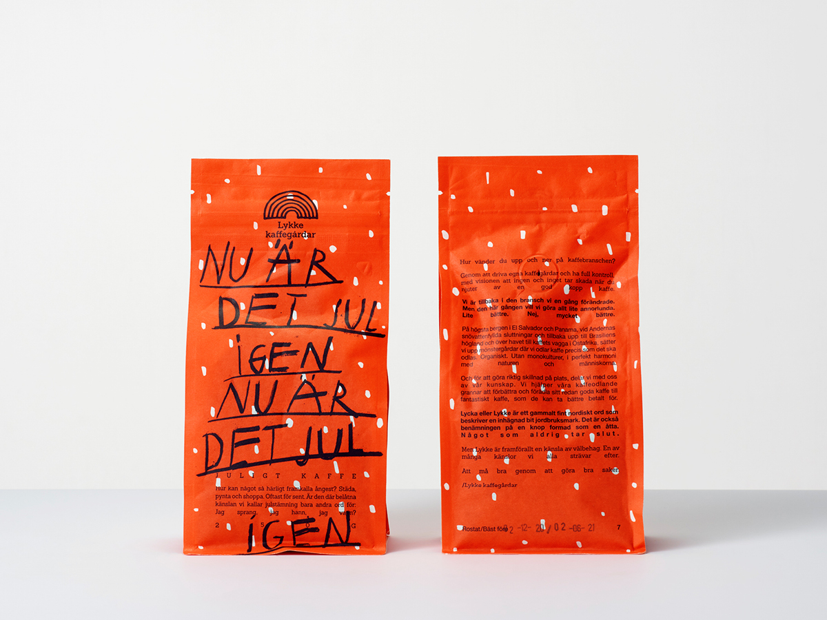
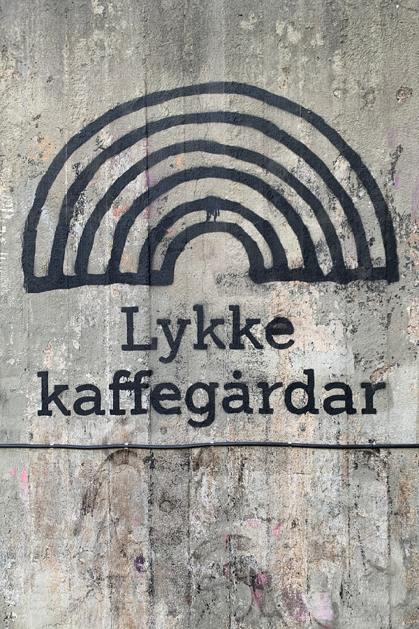
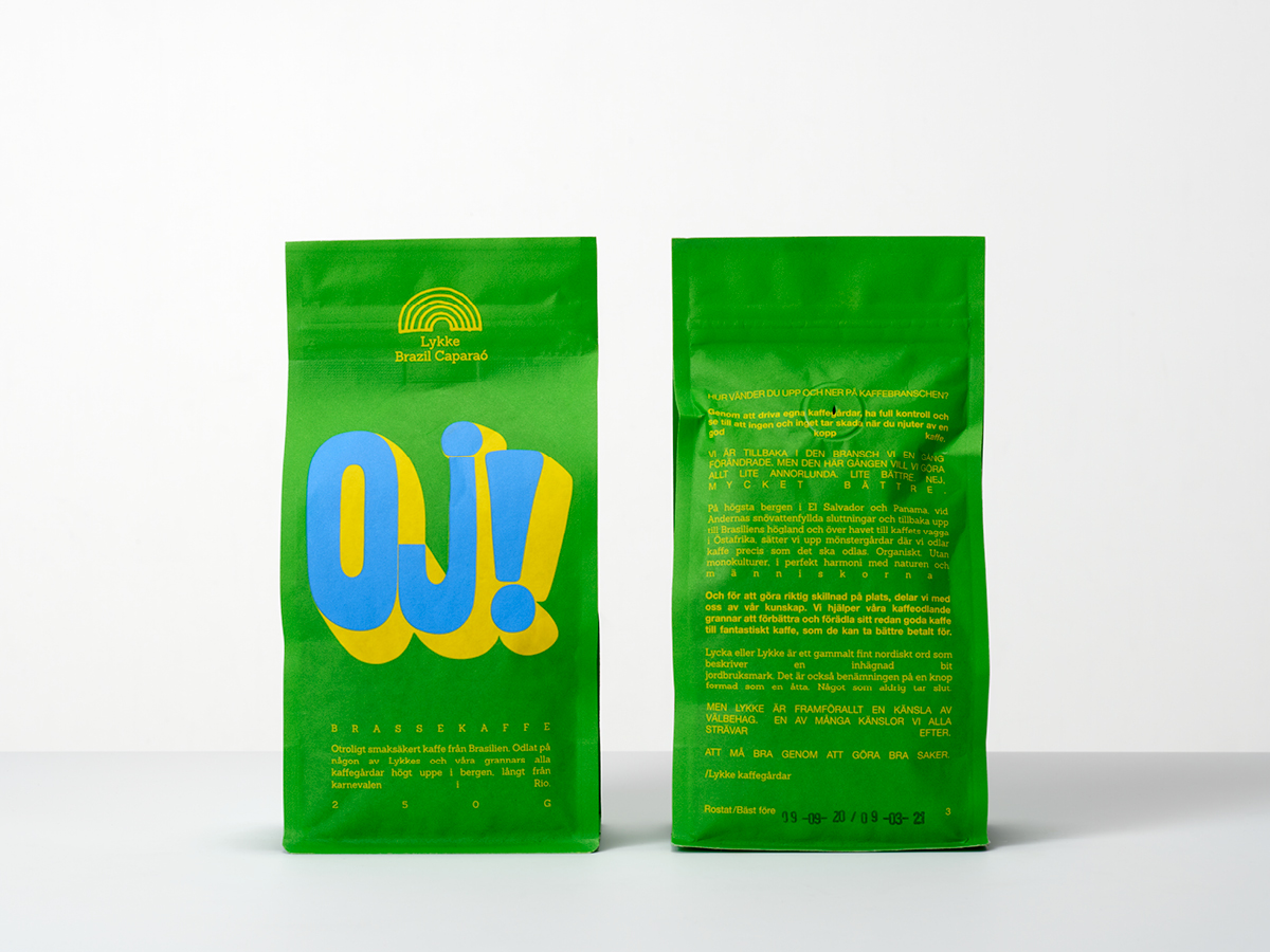
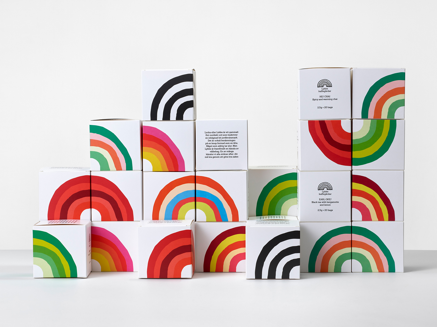
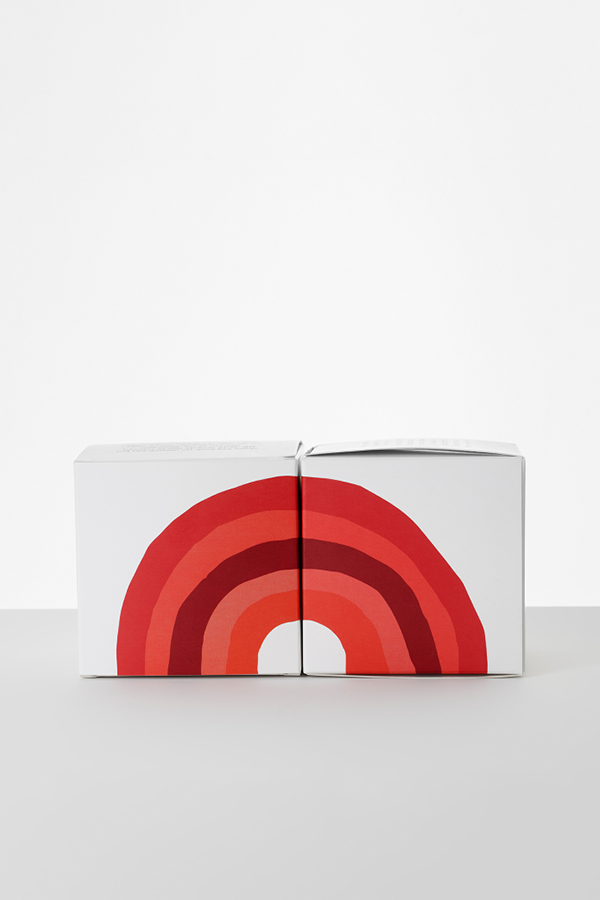
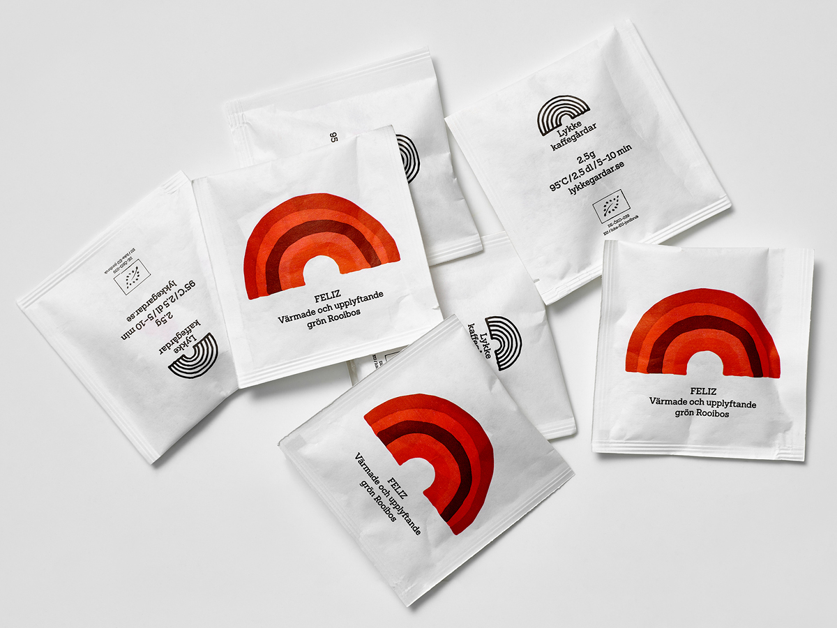
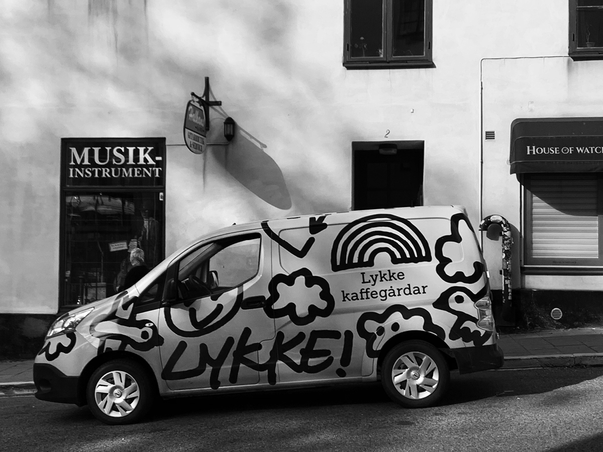
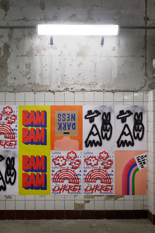
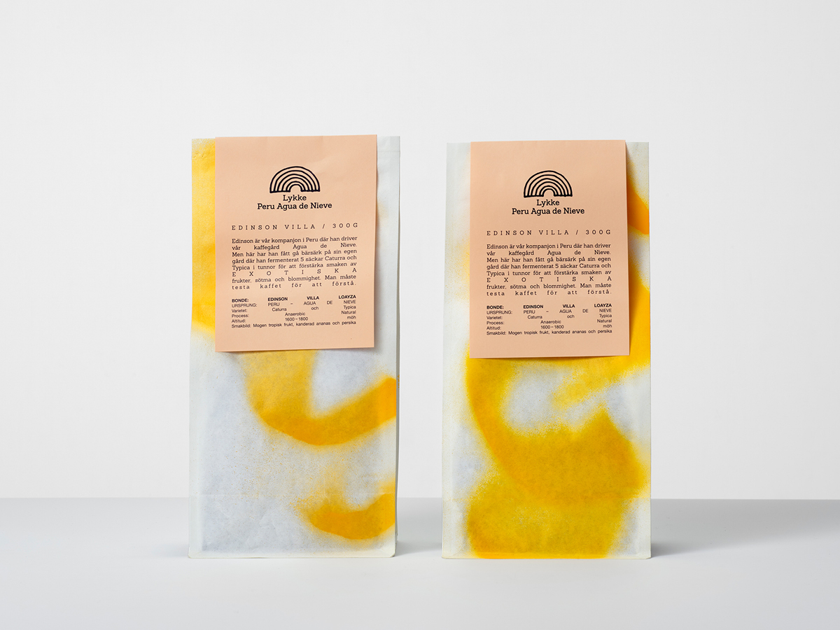
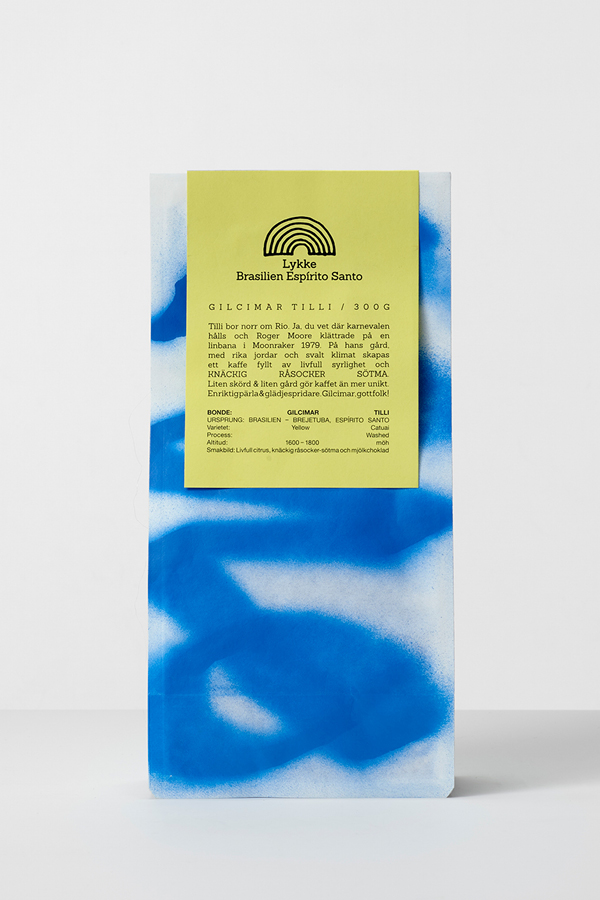
The visual identity is based on the rainbow that stands for hope and motivation and the promise of good things to come. To dramatize Lykke’s personality, the logo was drawn by hand and given colors that are not normally visible in a rainbow. The colors are constantly changing depending on where and how the logo is used.
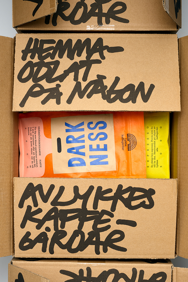
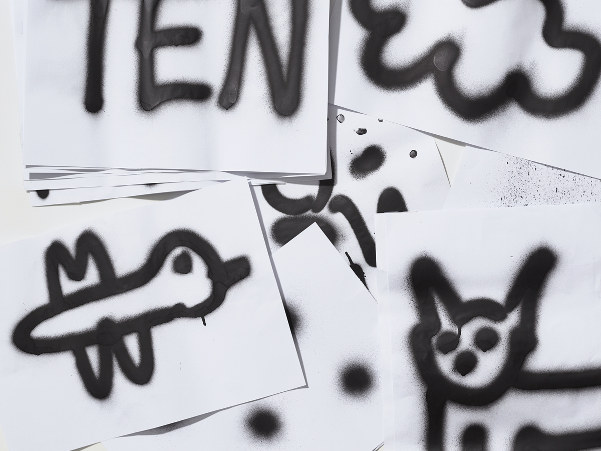
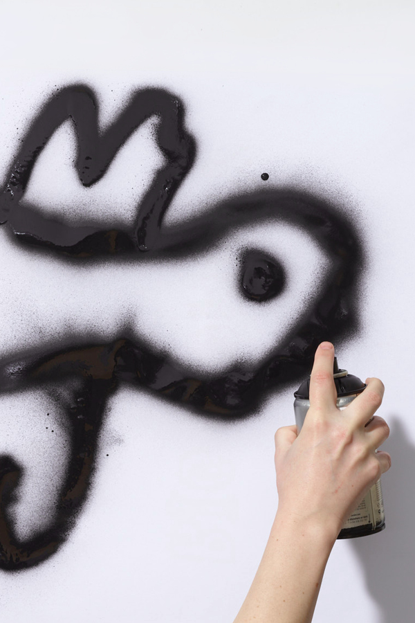
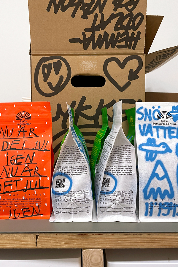
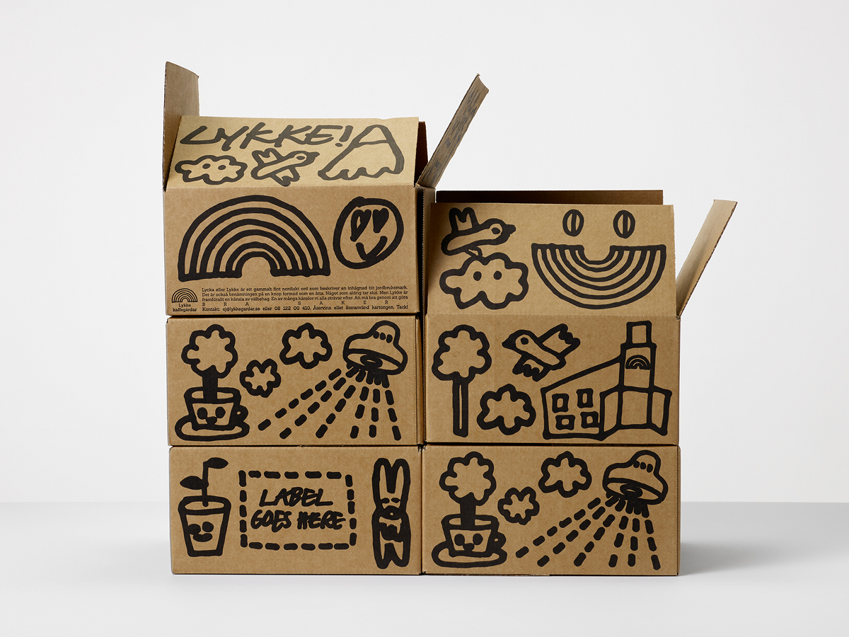
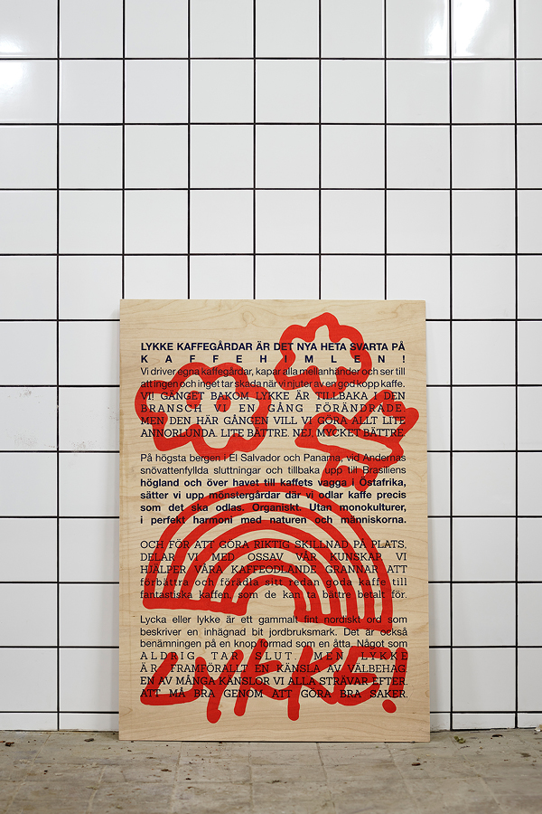
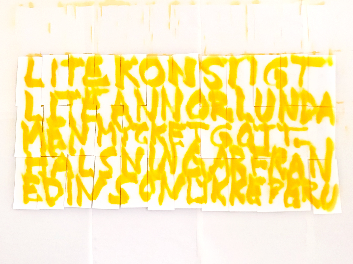
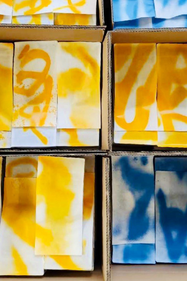
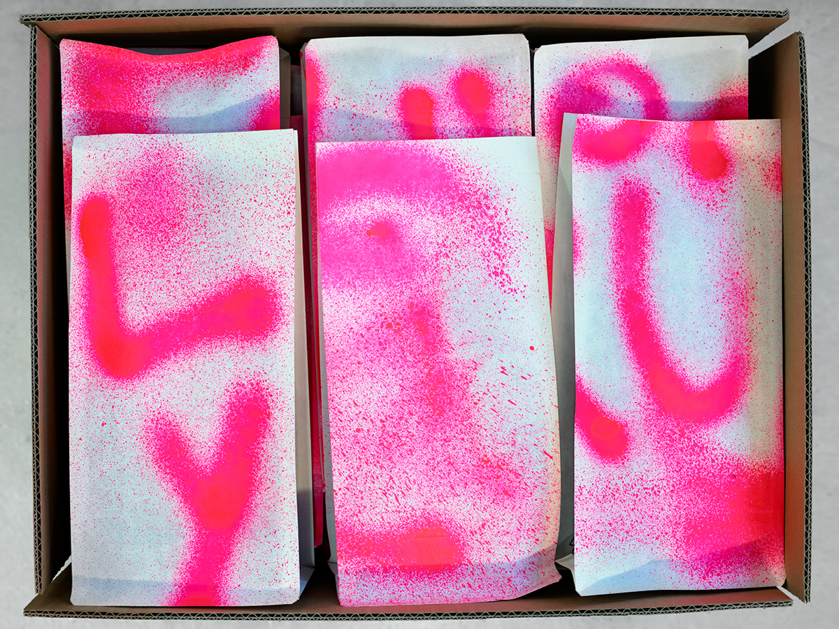
Illustrations are used uninhibitedly to reinforce and clarify dreams, tastes, visions and roasts. Pen is mixed with spray paint to convey the commitment behind each product.
The use of typography is simple but contradictory. With only one size, two fonts and the default setting for margin adjustments, we allowed non-design to become design.
Client: Lykke Kaffegårdar
Collaborations: Illustrator Andreas Samuelsson/Agent Molly
Scope: Design strategy / Visual identity / Packaging concept and design / Illustration / Design and final art