In Germany, ”Liebling” means darling.
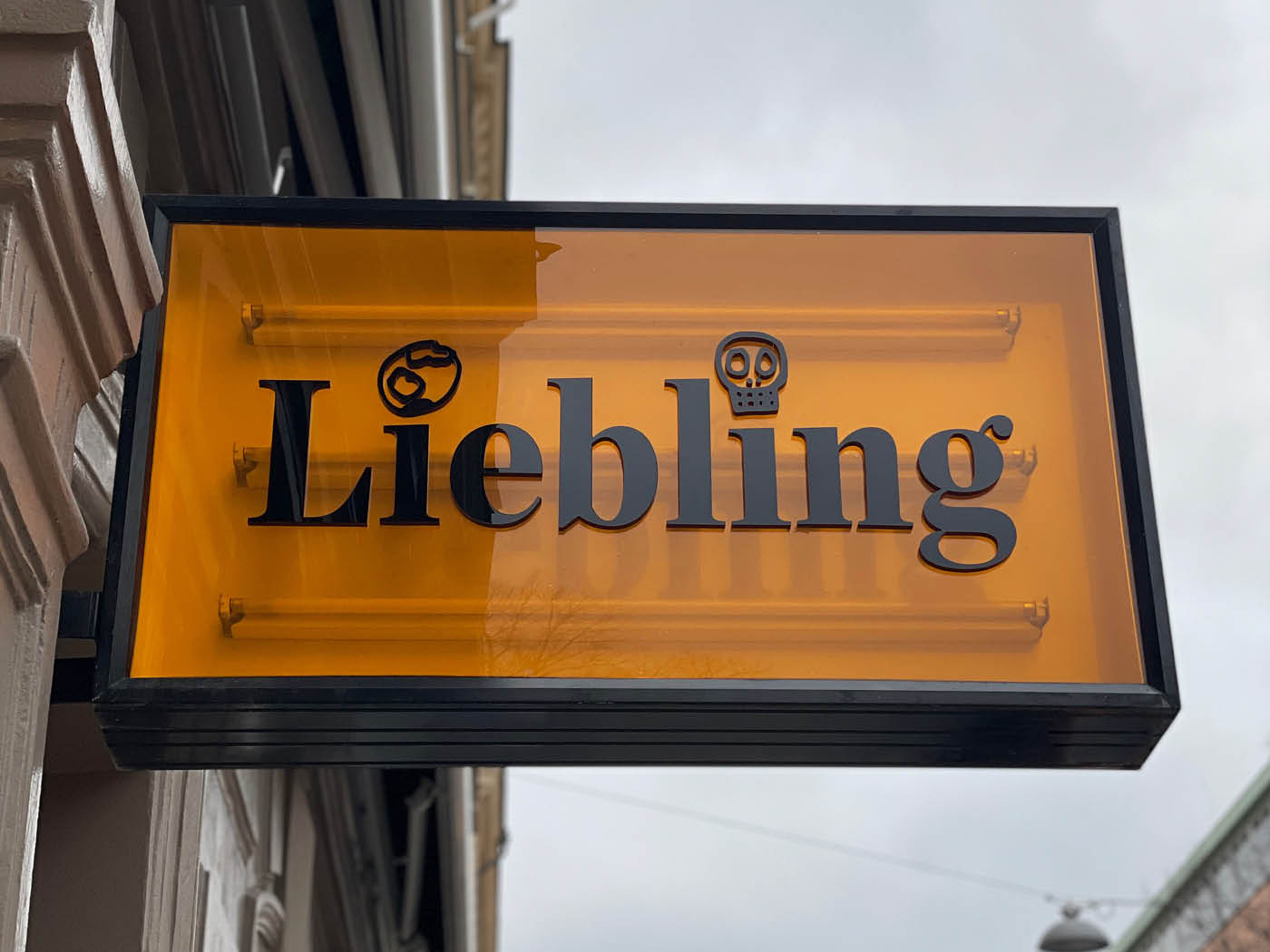
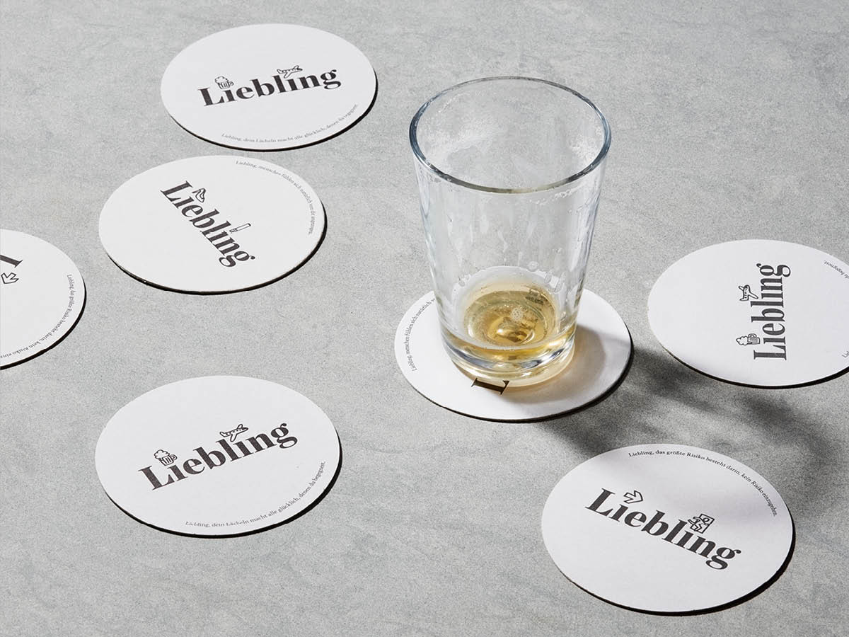
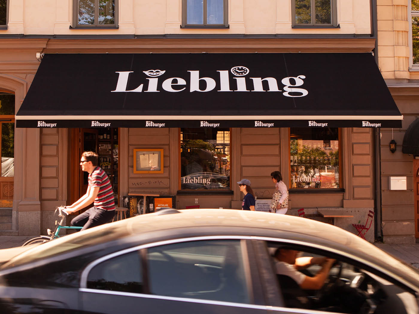
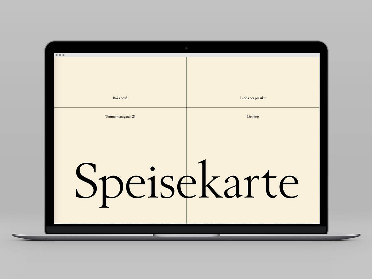
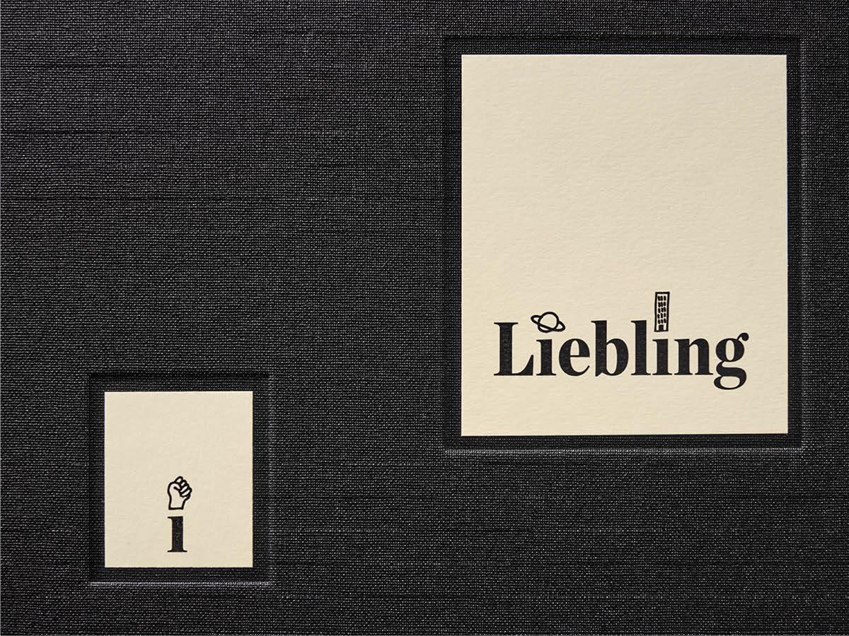
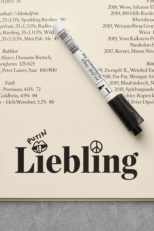
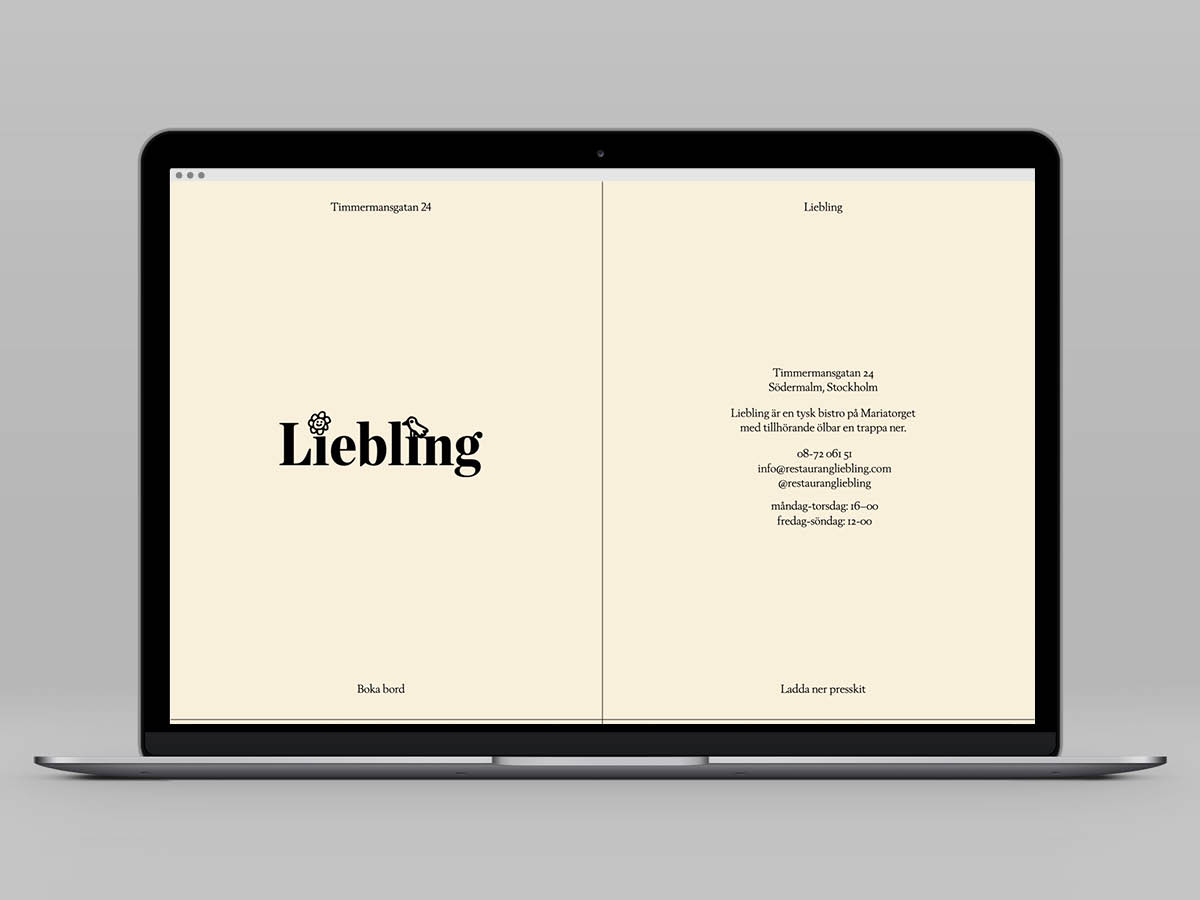
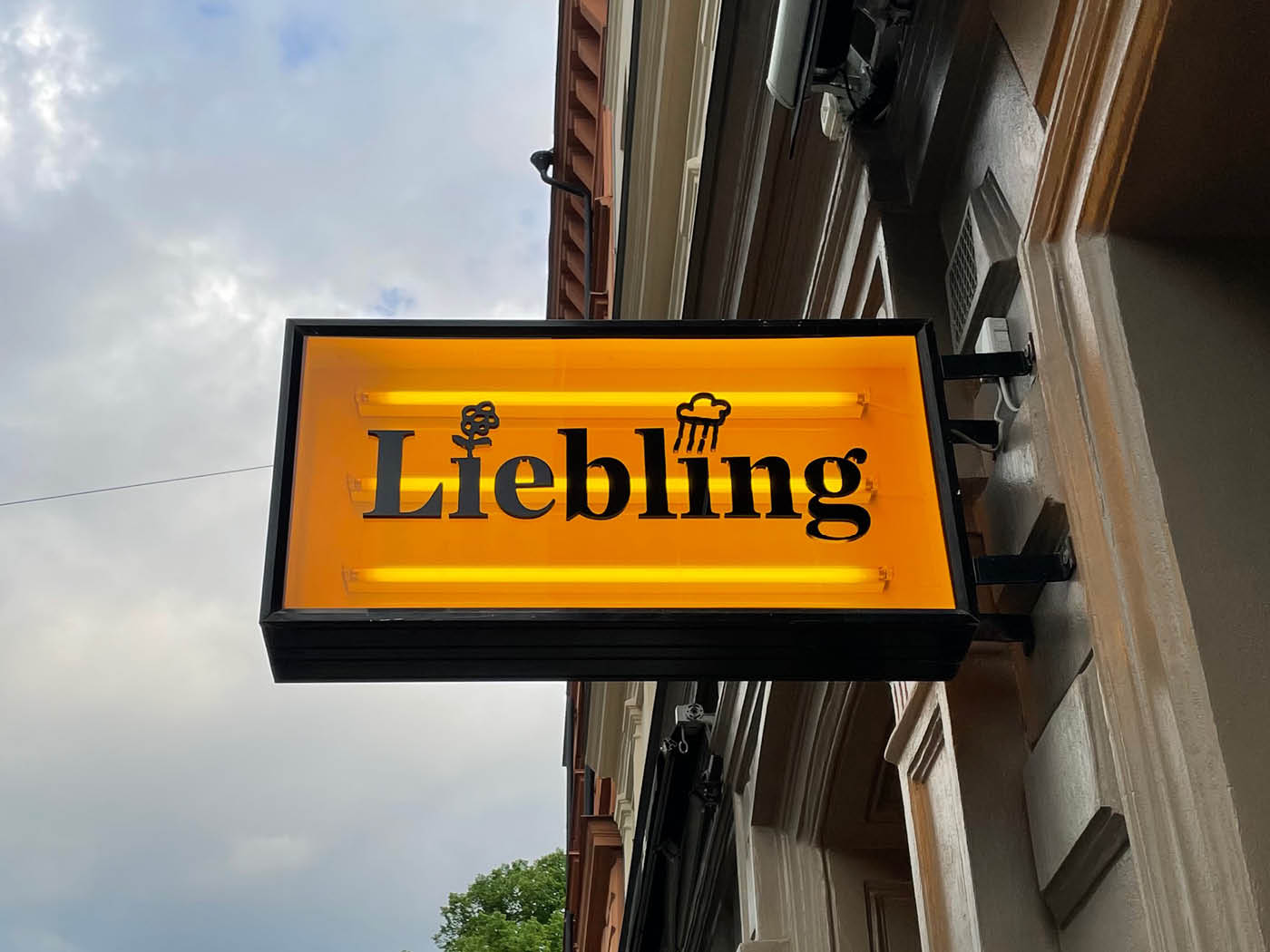
And in the word mark Liebling are two people hiding. Look at the letter ”i”: Two narrow small bodies, with invisible necks and small, round heads. No more is needed for love to arise. At any time, one can turn to the other, lean forward over the letters e, b and l and perhaps choose to say just ”darling”. (Or, yes, Liebling, if now this, the more enterprising of the two letters, would happen to be German speaking.)
In the same way, Restaurant Liebling’s identity captures what happens daily and at night across the restaurant’s table: Conversation after conversation, never the same ones.
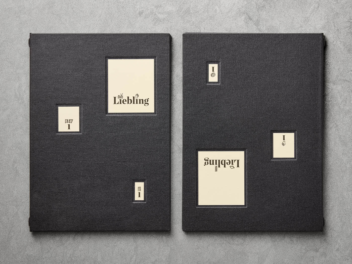
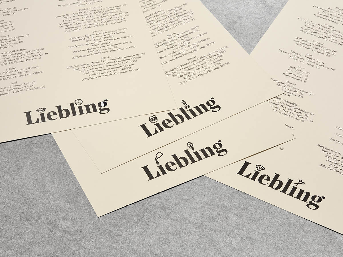
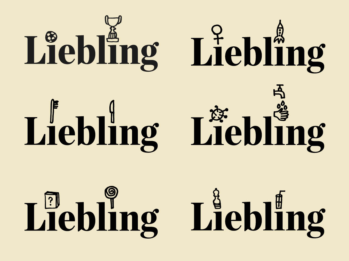
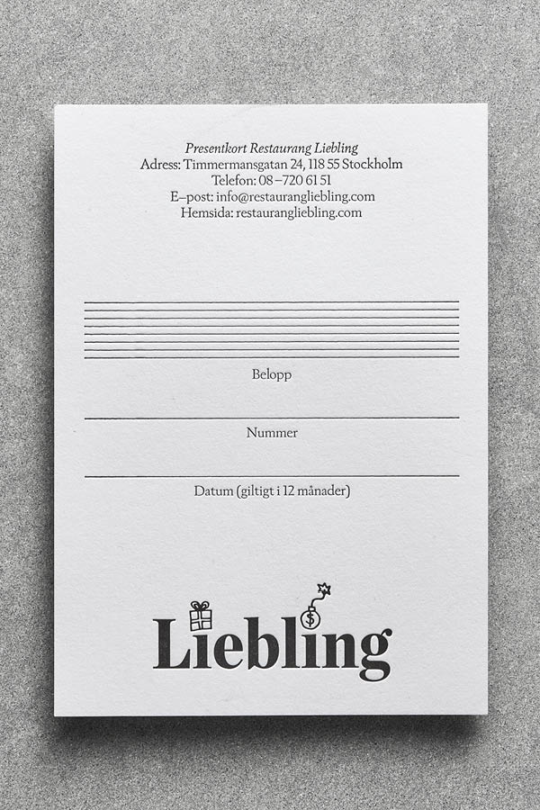
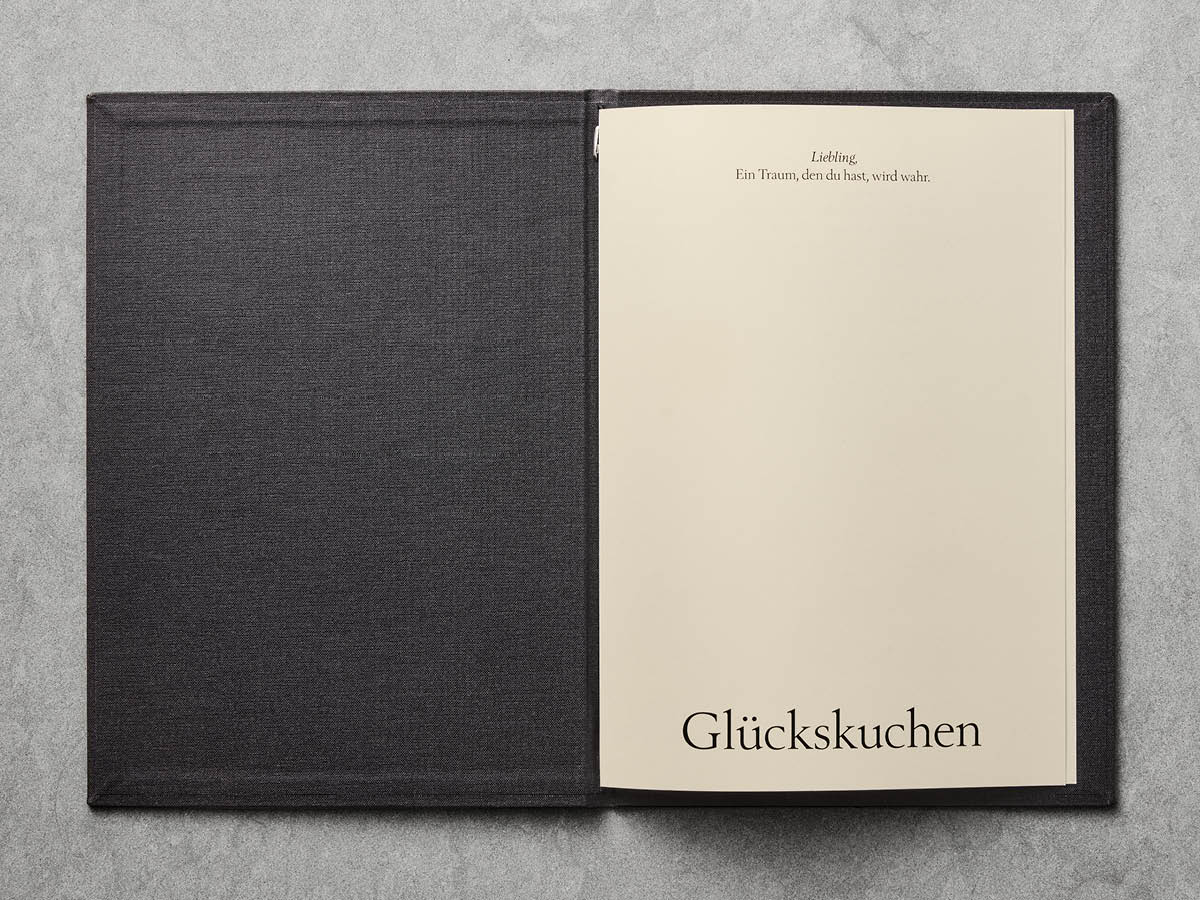
The names both “i’s” comes with different illustrations for each new application. The 20 menu binders have 20 unique illustrations. On social media and temporary daily menus, the staff can draw new illustrations themselves, to comment on a new dish or something that is happening in the world.
A ball and a trophy at a football championship, a pair of Lederhosen and a hunter’s hat at an Oktoberfest, a covid virus and a pair of washed hands in the event of new restrictions and so on.
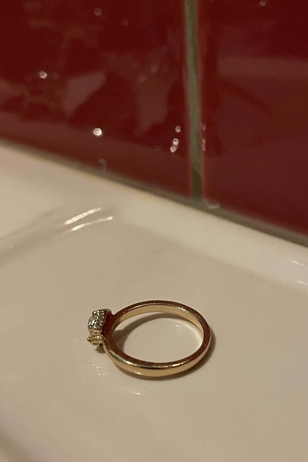
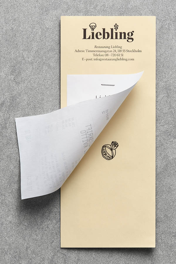
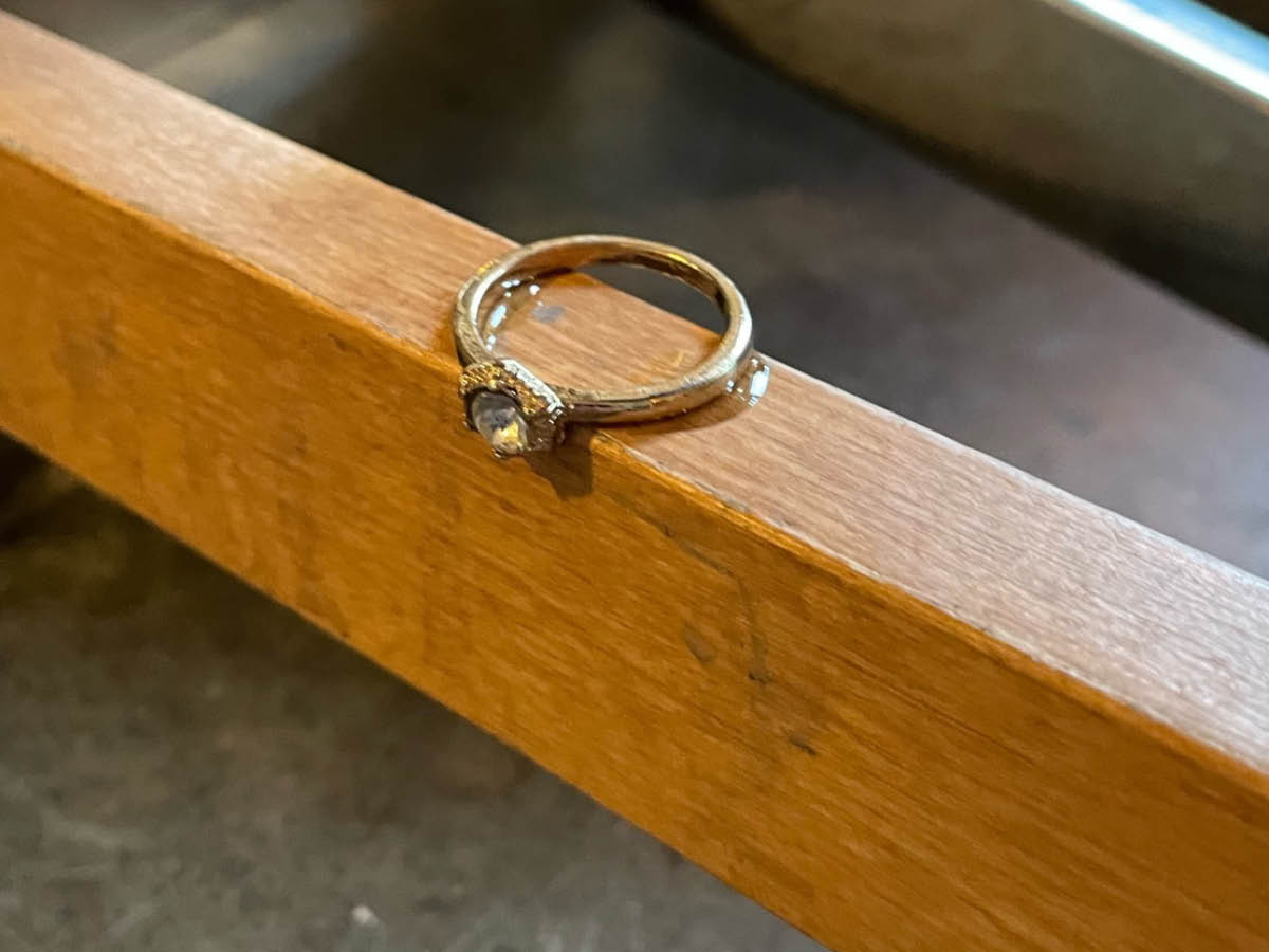
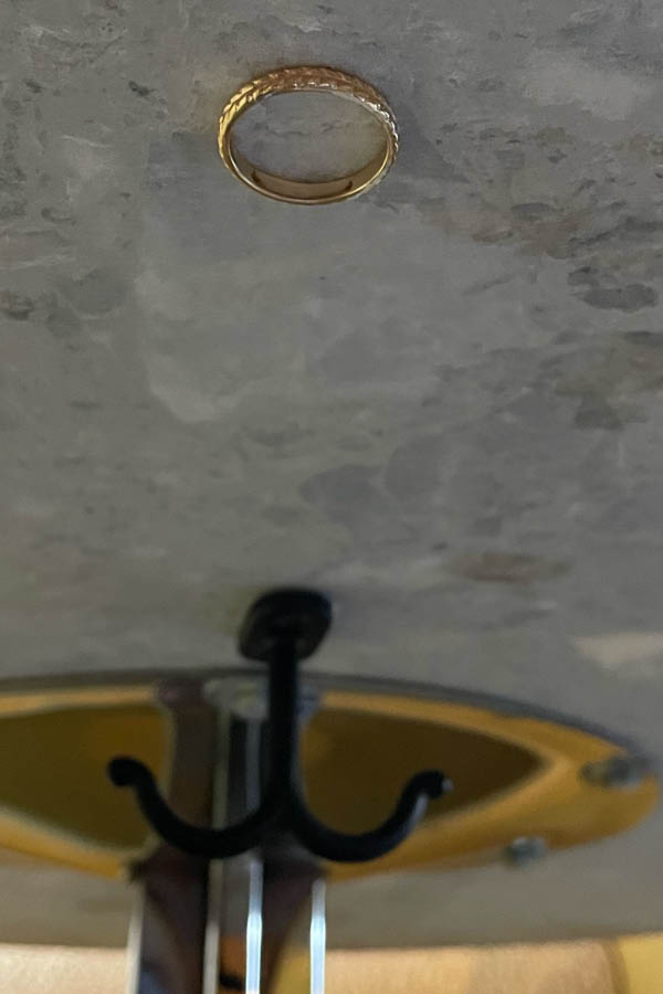
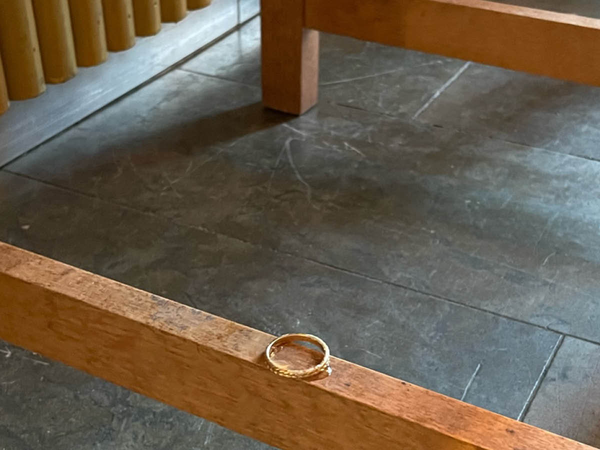
The identity also contains the very symbol for partnership – the engagement ring. It is also illustrated in various forms, always hidden. Sometimes on the back of a menu or inside a binder, sometimes under a receipt or even physically glued under the table or on the basin.
Client: Tjugogruppen
Collaborations: Digital partner Asso / Interior design CJ Studio / Print YT-Tryck / Menu Production Profilskaparen
Scope: Visual Identity / Illustration/ Graphic Design / Final art
