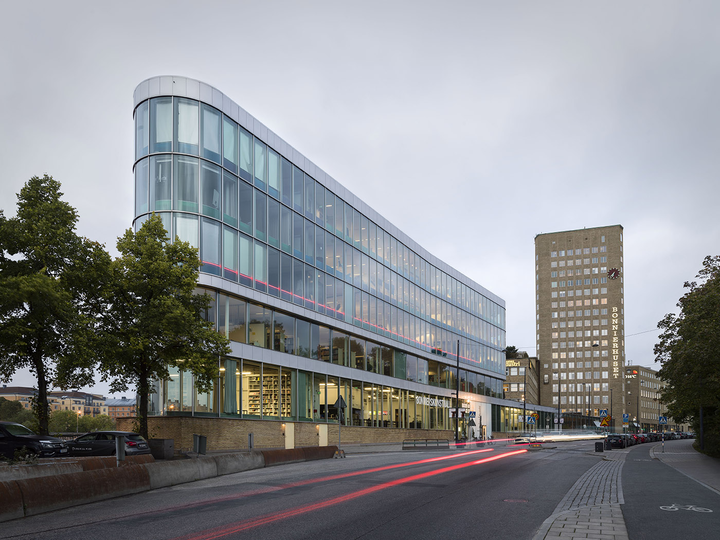
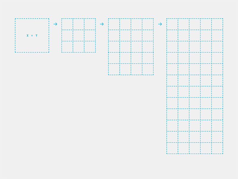
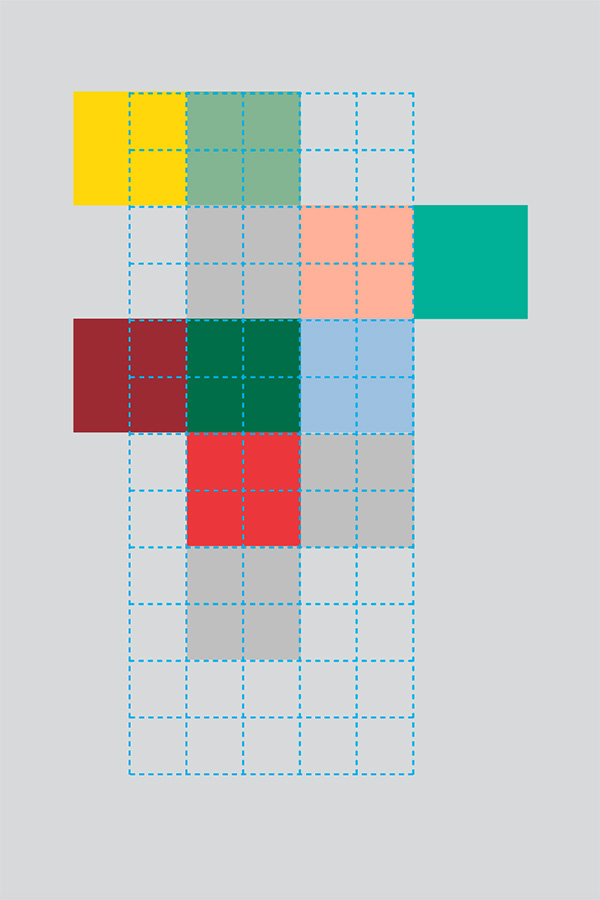
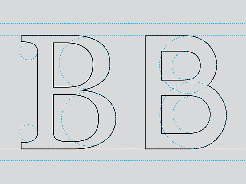
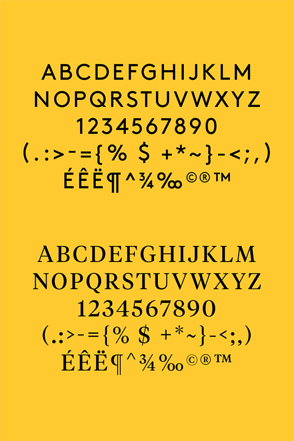
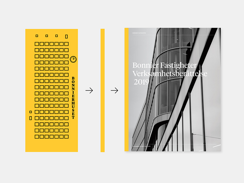
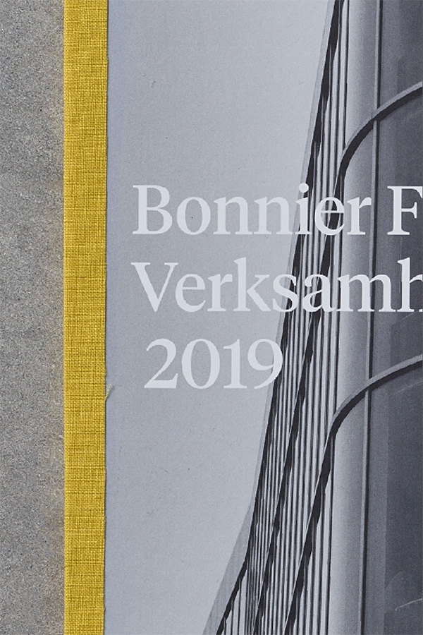
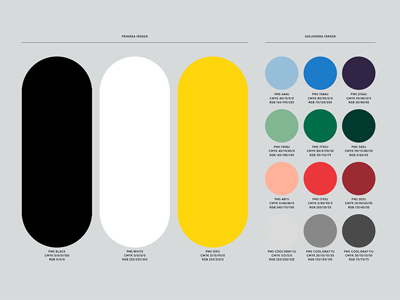
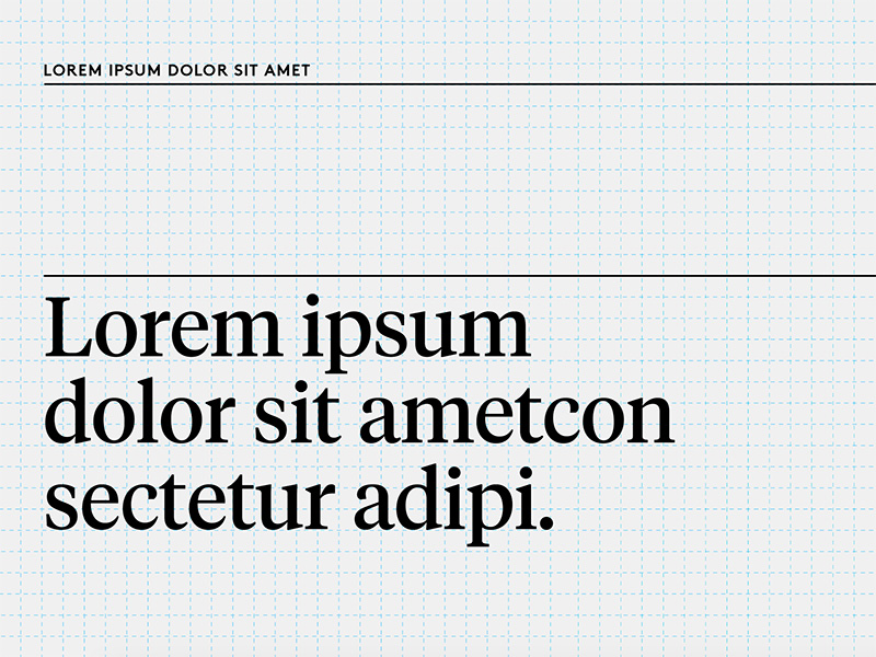
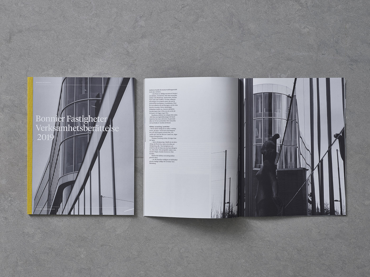
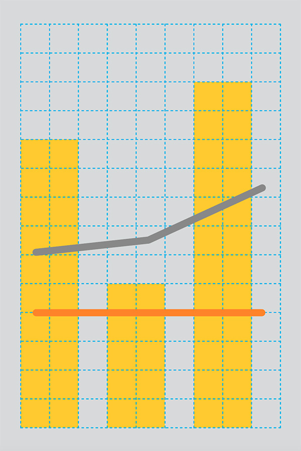
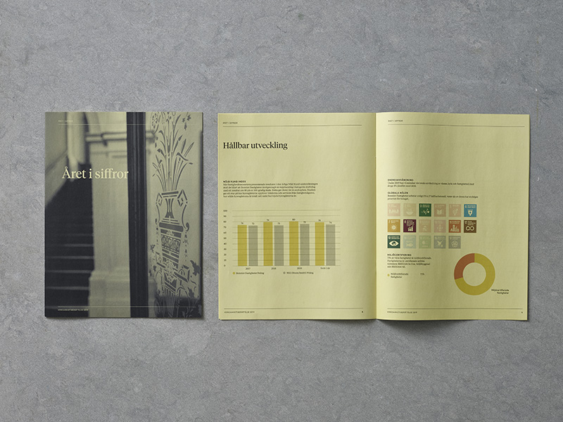
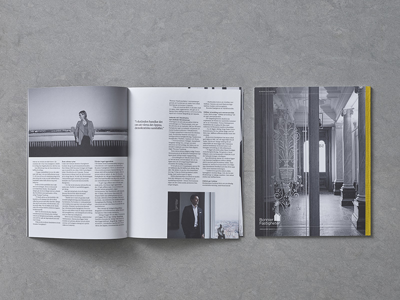
Like properties, great visual identities are built from the ground with well-built components and a theory behind every object’s placement. Thus, Bonnier Fastigheter’s visual identity consists of few but distinct design elements where the yellow back (a simplified visualisation of the Bonnier building) is the spine of the identity. The tightly composed grid holds the identity together like the concrete steel of a building.
Client: Bonnier Fastigheter
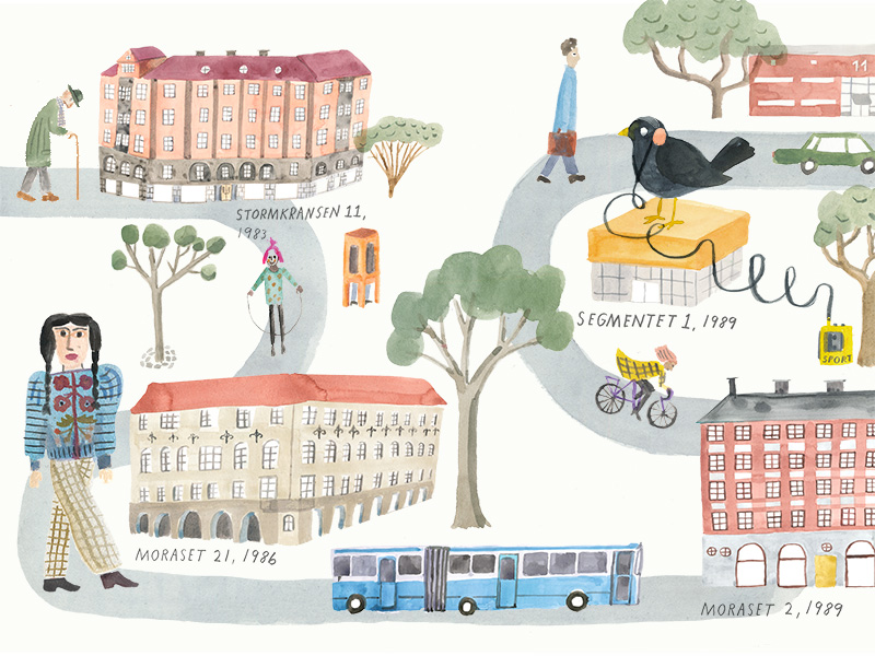
Collaborations: Photogaphers Carl Hjelte & Dan Sjunneson / Illustrator Maja Sten / Print YT-tryck / Sign Producer Expoimage / Print TMG Stockholm
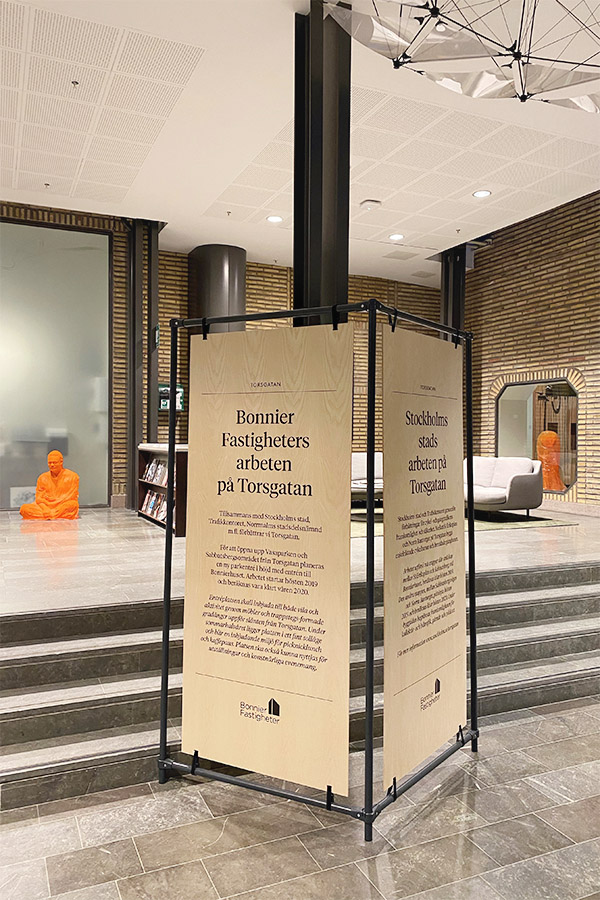
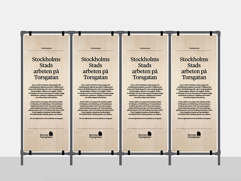
Scope: Design Platform / Visual identity / Signage / Web Design