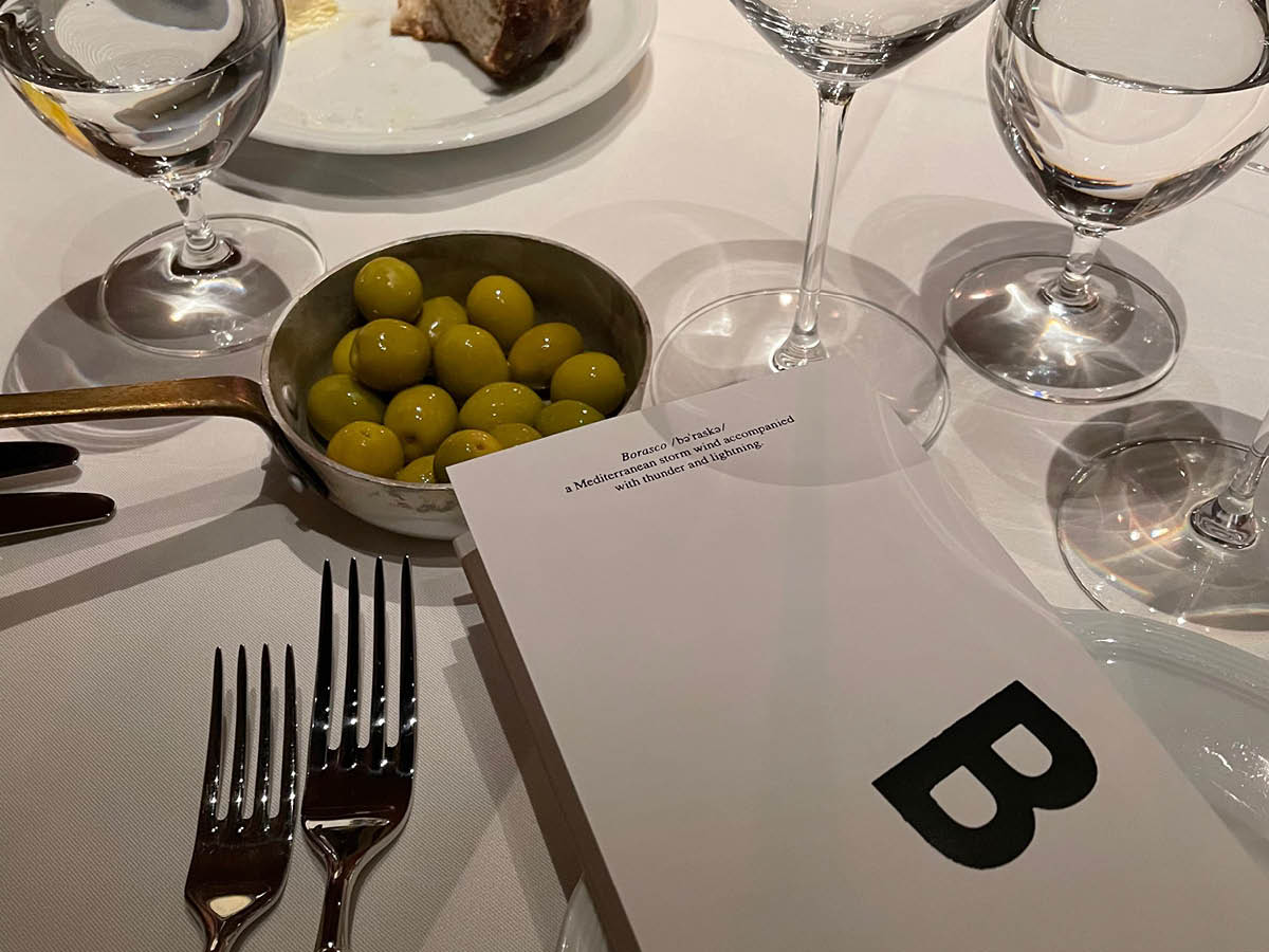
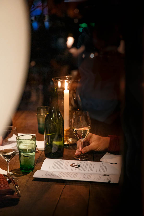
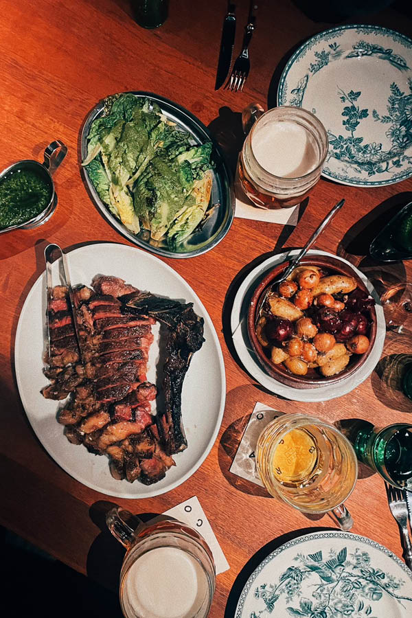
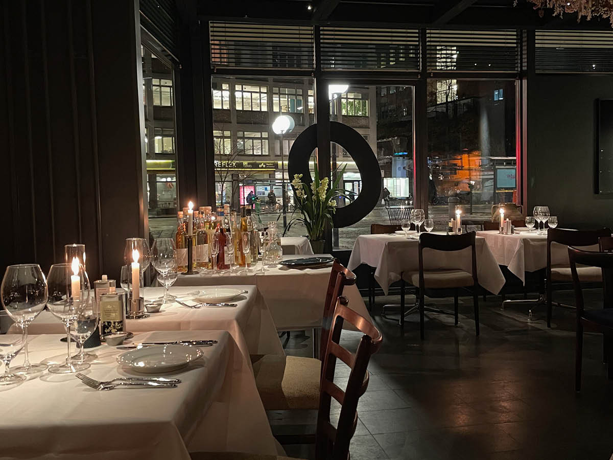
Borasco is a Mediterranean storm wind accompanied with thunder and lightning. But it is now also a restaurant on Södermalm in Stockholm. With a cuisine that originates from the regions where the wind blows.
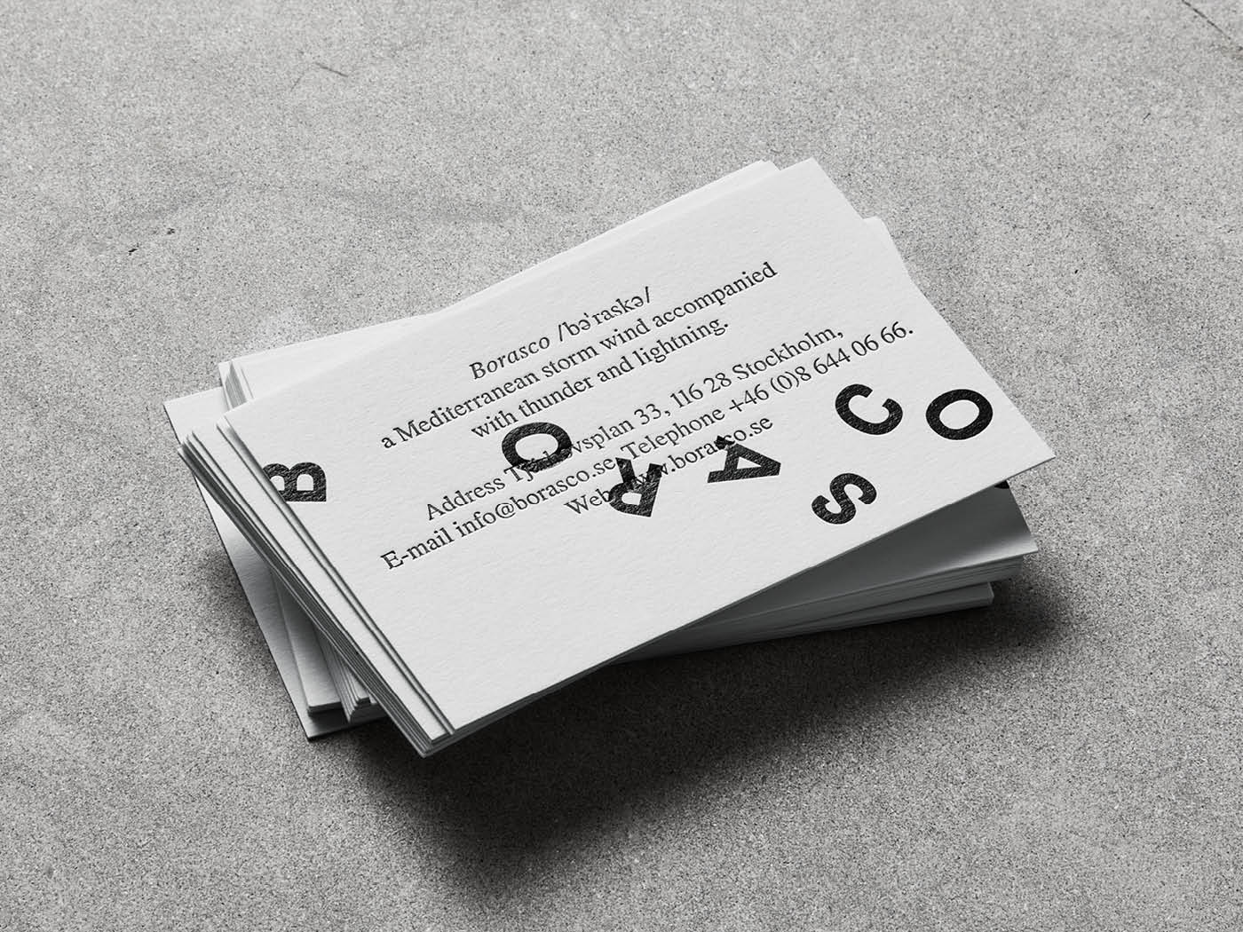
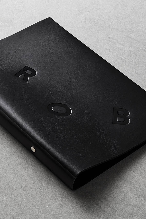
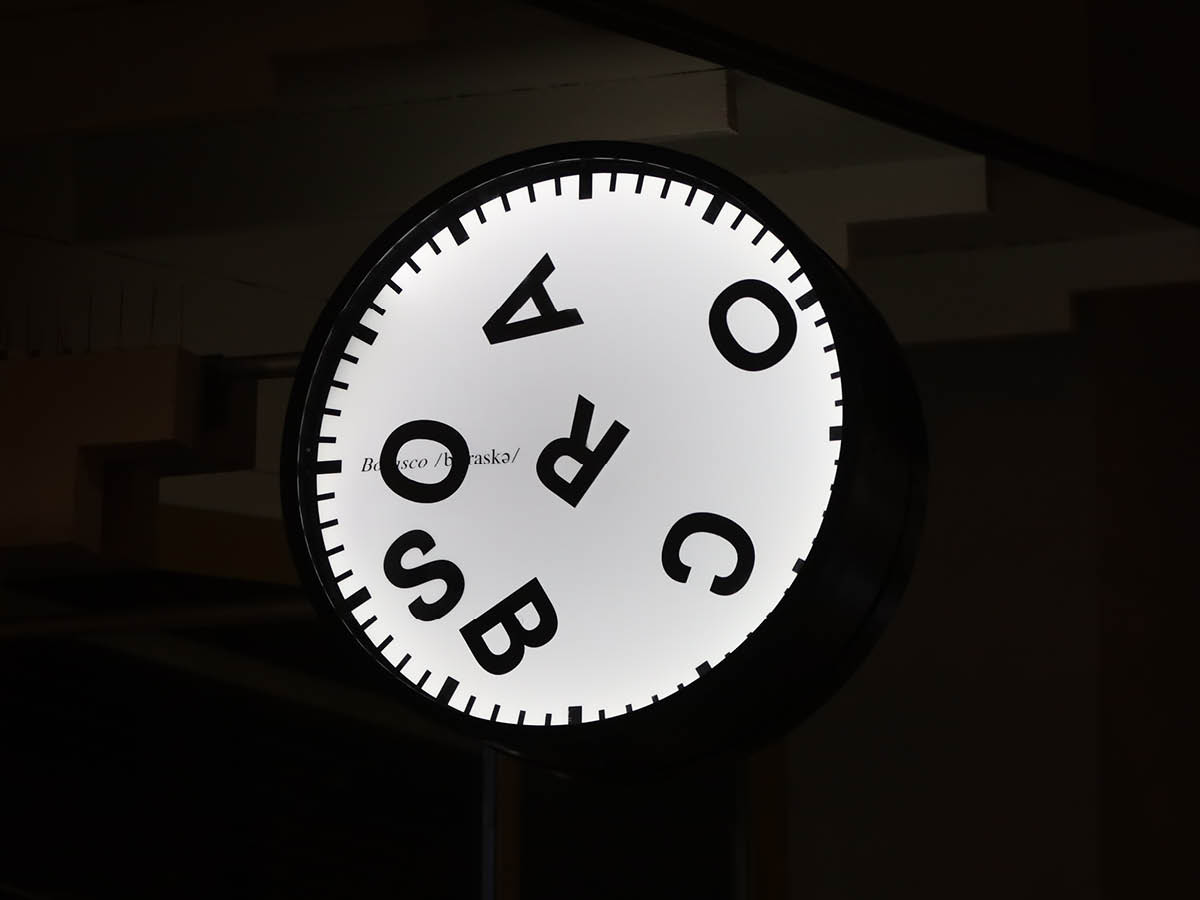
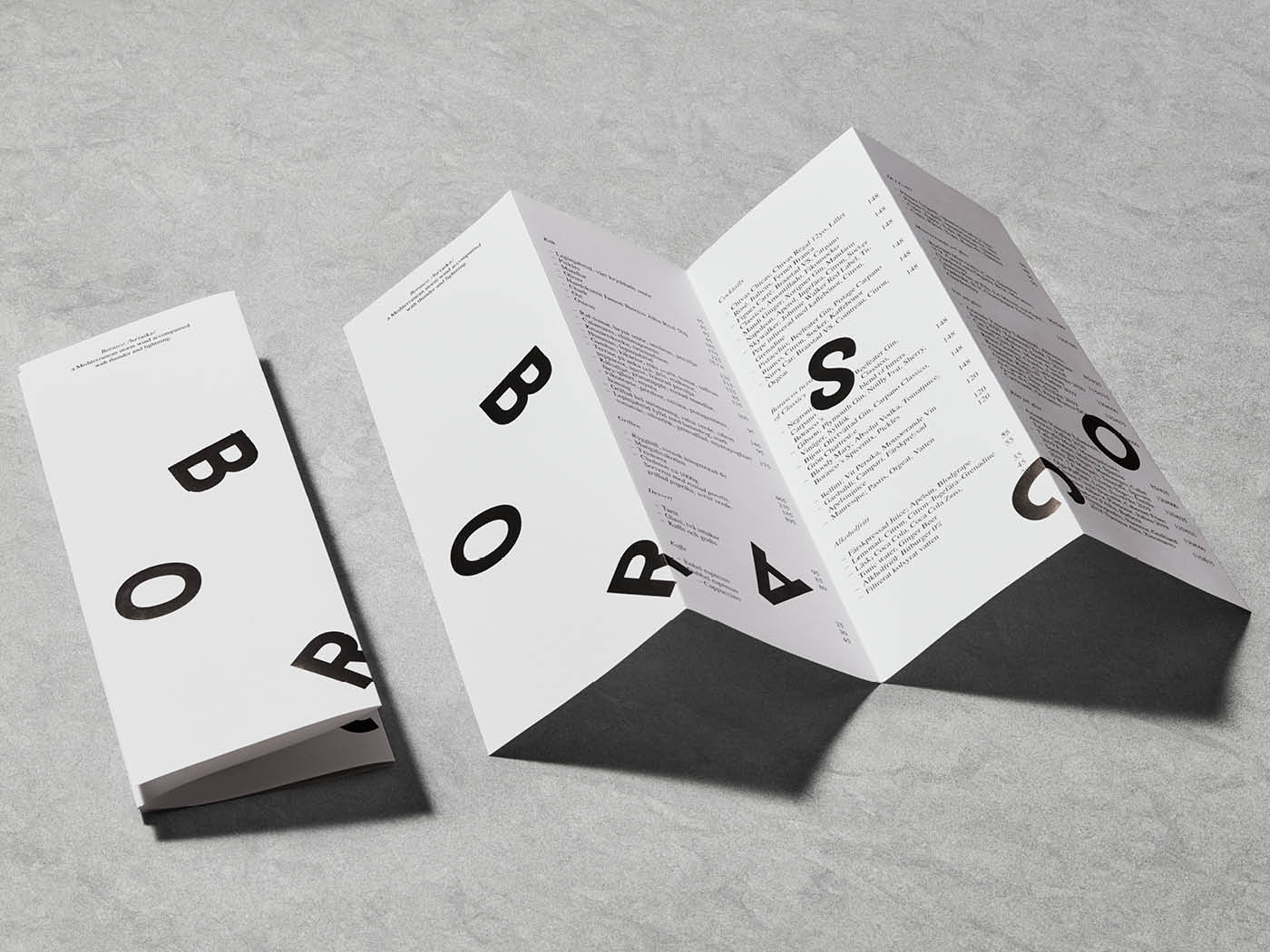
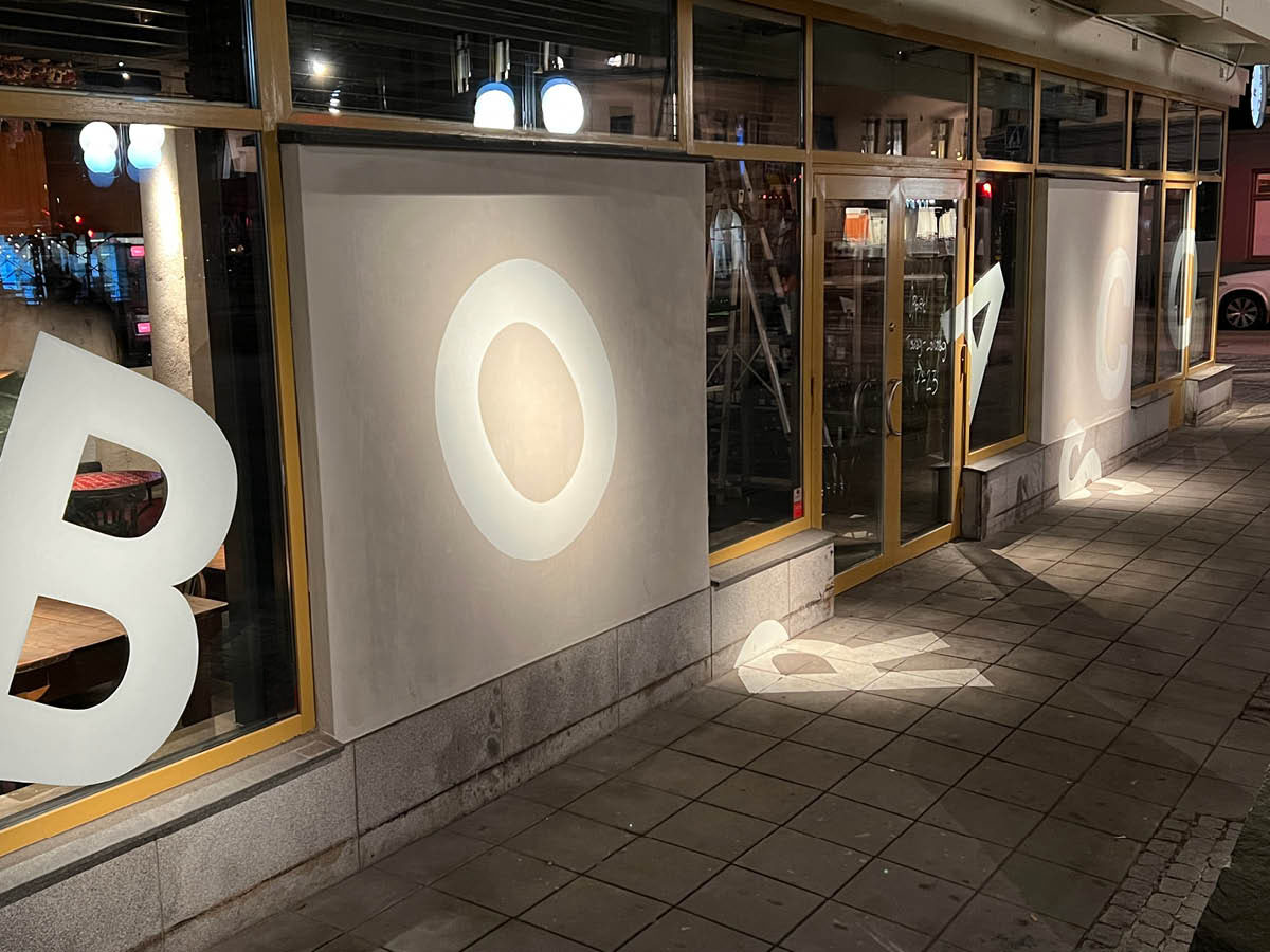
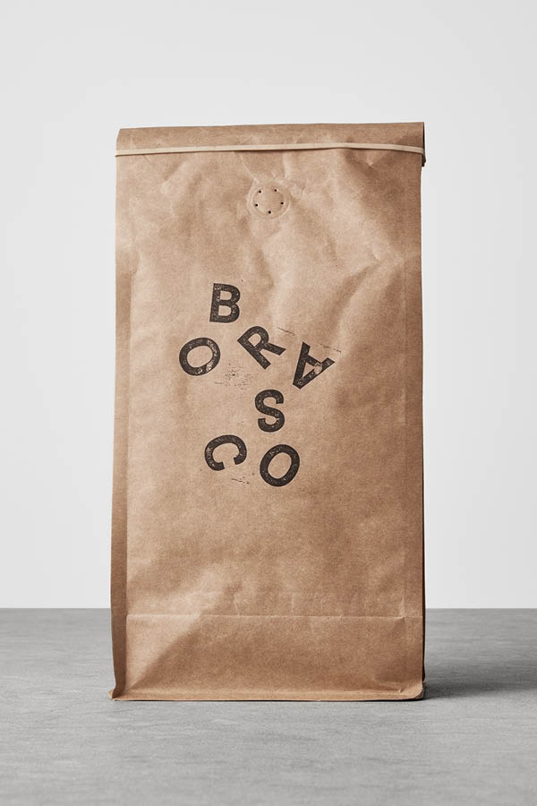
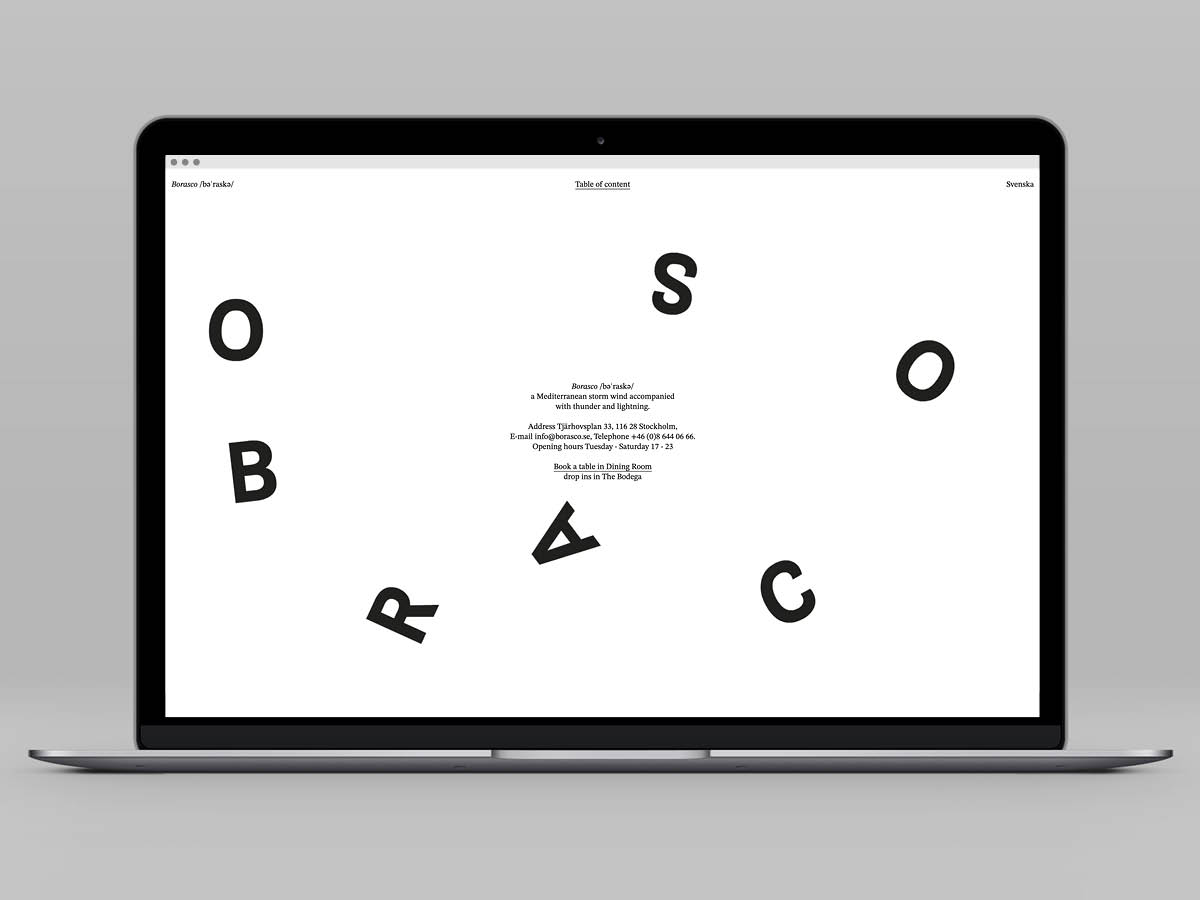
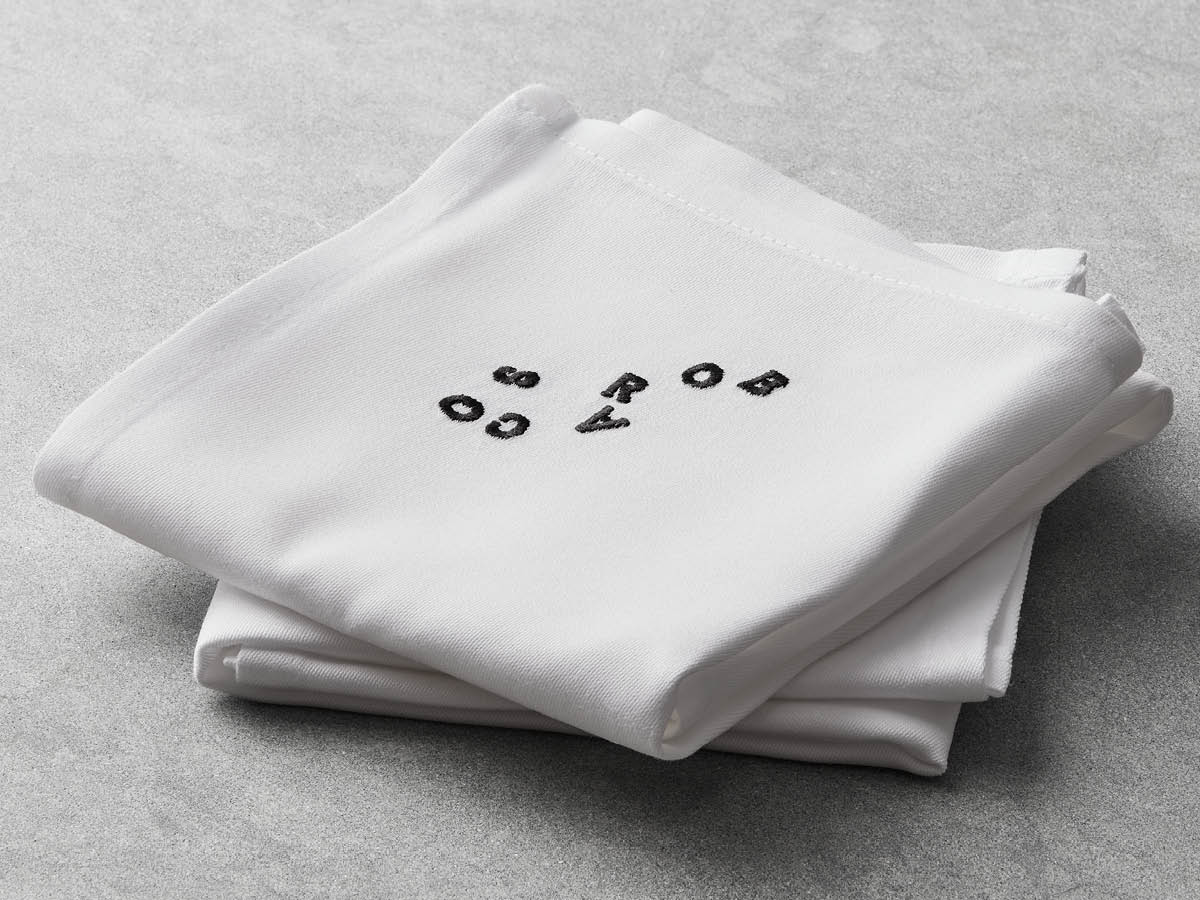
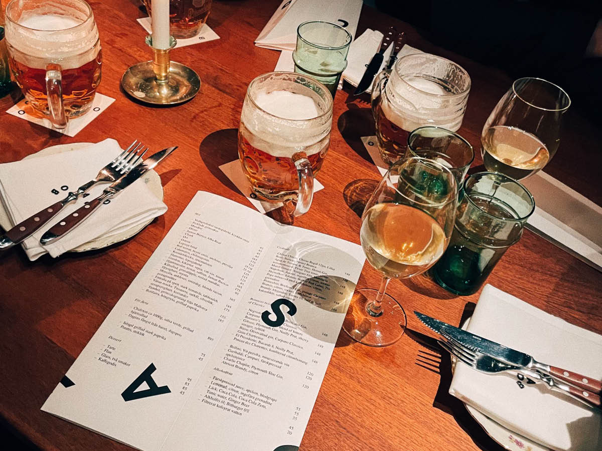
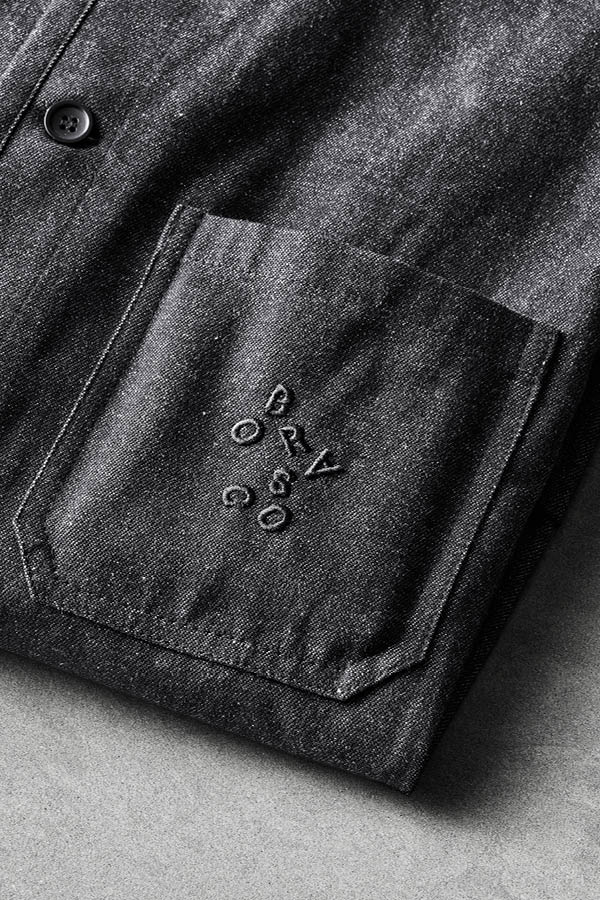
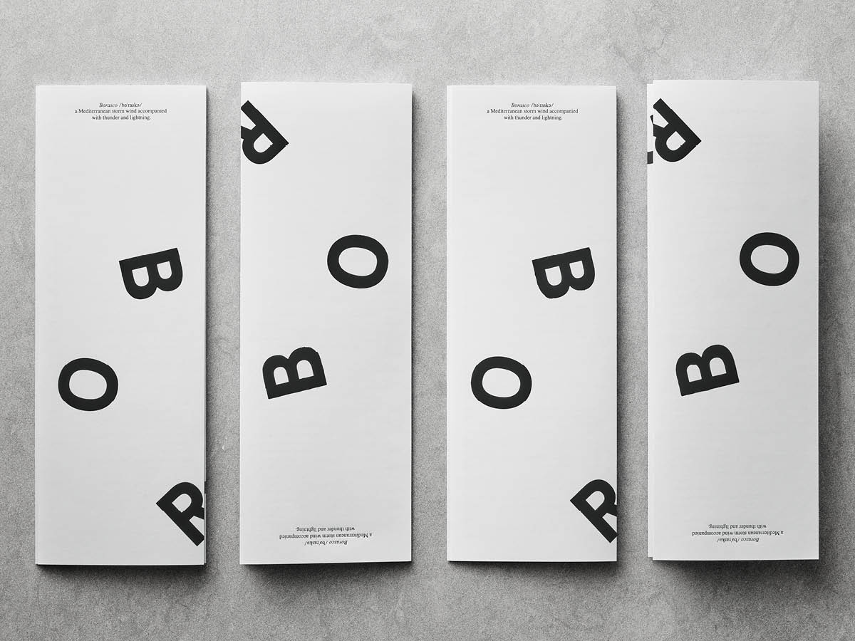
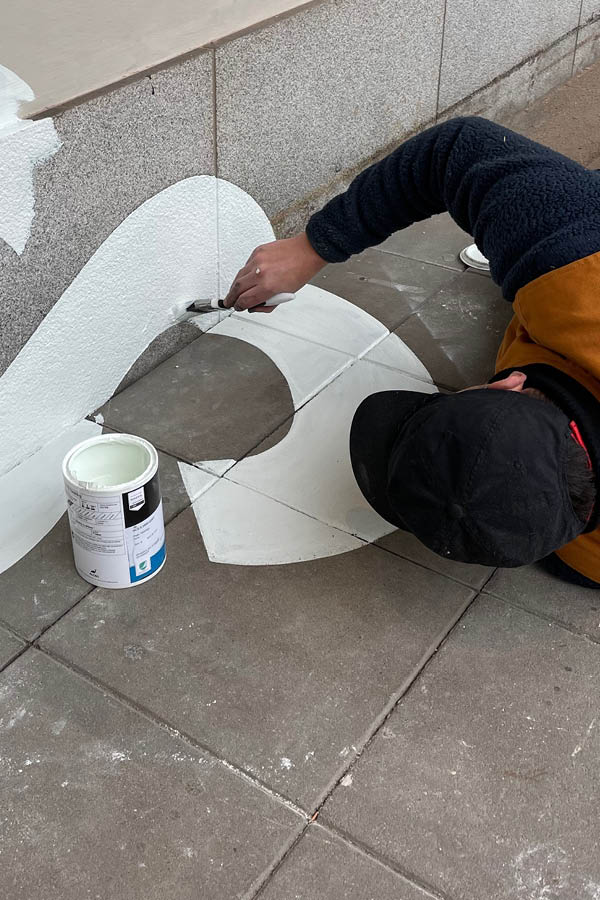
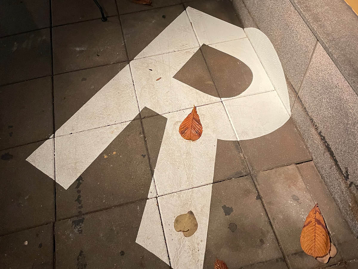
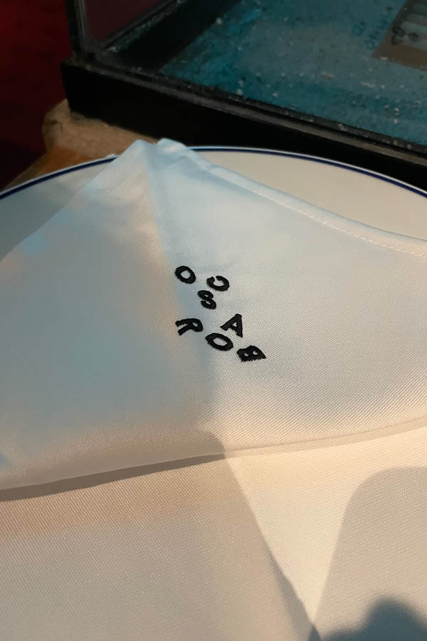
The ruthless Borasco wind has also left its mark on the restaurant’s visual identity. The letters of the logo are tossed around, in different formations on different units. The static information is carefully letter pressed while the digitally printed logotype has endless different variations.This to mimic the effects of the wind which can never be predicted. Even on the façade of the restaurant, the logo has been thrown up and pasted by the wind. (Or is it painted by hand ?!) The sign itself has been replaced with a train platform clock, which seems to have its own time zone. It shows restaurant time instead of normal time, and thus illustrates how time – yet for unexplained reason – can make quantum leaps when eating a good dinner. For the most part, the clock is ticking slowly, softly backlit in opal white. When it hits ”Borasco”, however, the clock suddenly starts to go backwards, adopt new colors and surprise with other oddities that are completely normal for restaurant time.
Client: Robert Rudinski
Collaborations: Copywriter Mattias Jersild / Digital partner Auxality / Print YT-Tryck / Clock production J©KE Illumination / Facade painting Stockholm Sign
Scope: Naming / Visual identity / Design / Final art
